Dal.ca Unveils New Homepage and Site Enhancements, Reflecting University’s Evolution
A new dal.ca homepage and About section of Dalhousie’s website are launching this week (Thursday, Feb. 29) — the first major step towards bringing the university’s reimagined home on the web to life.
The launch of these sections follows three years of dedicated work and planning on the dal.ca Web Renewal Project and signifies the completion of the first phase in the rollout of entirely reimagined design and content. It’s all underpinned by brand-new website infrastructure powered by Adobe Touch UI, making Dal one of the first universities in Canada to launch a website using the new Adobe platform.
Rebuilding dal.ca from the ground up
Last year, 8 million users visited dal.ca, viewing the site’s pages over 52 million times total. This makes it Dalhousie’s largest and furthest-reaching digital platform — and the face of the university to the world.
The dal.ca Web Renewal Project aims to modernize the technology powering the website, recognizing its importance as a communication, marketing and collaboration platform and acknowledging that the site’s aging infrastructure is in need of a major upgrade. The vision for the ambitious project went beyond the technology, though, seeking to completely overhaul the site’s design and content to enhance the overall experience for the millions of people who use it each year. The project has focused on ensuring the new dal.ca is more user-friendly and accessible in its design, with streamlined content that’s more relevant and engaging to visitors.
“This project is rebuilding Dal’s web infrastructure from the ground up,” says Matt Proctor, Dal’s assistant vice president of Communications, Marketing & Creative Services. “It’s the digital equivalent of deconstructing all the buildings on campus, and then rebuilding them brick by brick — just done digitally. With nearly 100,000 pages on our site, it’s been a massive effort — but the outcomes of improved user experience and accessibility will benefit our entire community for some time to come.”
Starting with home and “About”
The homepage and About sections were selected for the initial launch because they serve as the cornerstone of the dal.ca site, providing a critical first impression and foundational understanding of the university.
Serving as the digital front door, the homepage was chosen to make a strong first impression, showcasing the university’s commitment to innovation with its modern, accessible, and mobile-friendly design. Similarly, the About section was prioritized as an opportunity to showcase Dalhousie’s core values, mission, and vision, offering a comprehensive overview that highlights the university’s dedication to equity, diversity, inclusion, sustainability, community engagement, and global impact.
It takes a village
Stakeholders across the university have collaborated on the new dal.ca/about section, combining 14 former stand-alone websites into a single, integrated section. What used to be over 900 web pages have been streamlined down into just 347 — ensuring information is easier to find and navigate. The new content was put together by a task force of six authors assembled from across Communications, Marketing and Creative Services (CMC) over the past 18 weeks.
The new instance of dal.ca was built completely in-house by the Information Technology Services (ITS) Web Team on the Adobe Experience Manager (AEM) Touch UI content management system. They worked side-by-side with CMC and external partners to translate the research, designs, data and insights from stakeholders into a custom version of the Touch UI CMS that is specific to Dal.
While this launch is a significant milestone for the project, it’s only the first step in a multi-year rollout. A total of 340 sites, comprising 100,000 pages on the old AEM Classic system, are slated for migration via the Site Transition Program (login required). Subsequent content will be launched in phases based on factors including a Faculty or unit’s progress through the Site Transition Program (STP), alignment with the overarching strategic goals and priorities of the university, technical dependencies, and requirements for custom functionality. The STP process also works in conjunction with significant work by Dal ITS to update our intranet platform, known as myDal. Through the STP, content authors are asked to consider where best their content should live ensuring an audience-first approach.
What to expect
With this launch and during subsequent phases, dal.ca will progress through a transitional period where it will operate as a hybrid of our current site platform and our new platform. Newly launched sections of dal.ca have an accessible, mobile-friendly design with a modern look and feel reflective of Dal’s new branding as well as revamped navigation.

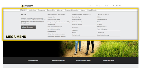
The new “mega menu” shows key pages and content at-a-glance.

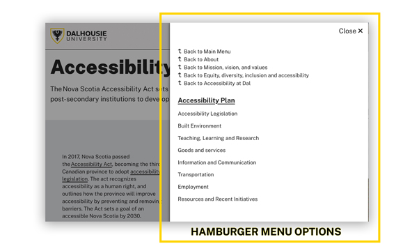
The “hamburger menu” isn’t edible, sadly, but can be accessed from the Menu label at the top right of the screen and takes visitors anywhere within the site.
Behind the scenes, the platform offers a modern code base and development tools, better support from Adobe, and improved content-management features, for a higher-powered, scalable, and maintainable website.
For the second phase of the rollout, the Office of Advancement is hard at work preparing for the launch of new Alumni and Giving sections in mid-March, ahead of its upcoming comprehensive campaign in April 2024.
The Digital Marketing Platforms (DMP) team will be translating lessons learned from the launch of Home and About into revised Site Transition Program (login required) materials and new Touch UI training materials to assist Dal’s authoring community with preparations for the renewal of their own sites.
The vast majority of web content has yet to be transitioned over to the new system, so the DMP team will continue to support the many stakeholders working towards completion of the STP while investigating additional solutions that may help to accelerate and or simplify future site migrations and updates.

