
Modern Photoshop Techniques Traced Back to 17th Century Dutch Painters, Study Reveals
A new study has identified that the skills painters applied in the 17th century to bring out the vividness in an object’s colour are the same as the techniques used by AI to brush up modern-day photographs.
Researchers from Bournemouth University, UK and Giessen University, Germany found that by carefully positioning surrounding items of a similar colour, overlapping a central object, historical artists were able to enhance the colour of that focal object, making it appear more lifelike.
The findings have been published in the Journal of Vision.
“There are some laws of colour perception which scientists have discovered in recent years using computer screens in controlled laboratory conditions,” said Dr Matteo Toscani, Senior Lecturer in Psychology at Bournemouth University, who led the study. “The interesting thing this study showed is that painters interested in realism, such as Dutch painters in the 17th century, had already applied some of these laws in their work. This helped them to overcome the limits that they had in availability of materials at the time, and it is similar to what algorithms do nowadays to overcome the limits of colours in a computer screen,” he added.
Still life painters of the so-called ‘Golden Age’ in the Netherlands are famous for their masterful techniques of accurately depicting reality. This is especially true for their abilities to depict different material properties of fruits, flowers, food, table ware and animals.
In this research, Dr Toscani and his team, took high quality photographs of forty-eight classic still life paintings from the era, each showing pieces of fruit. They then cut out the central objects – half showing just the single fruit and half including the surrounding context. Fifteen people were asked to rank the photographs based on how they perceived the vividness of the central item when presented within its original context or alone on a neutral background.
The results showed the key mechanisms that artists used to enhance the vividness of the central object’s colour:
- Increasing the variety of colours in the surrounding environment.
- Grouping objects of similar colour together.
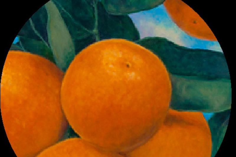
Whilst the central items such as apples or oranges, appeared shiny and lifelike in these contexts, they appeared to have more of a greyish contrast to them once the context was taken away.
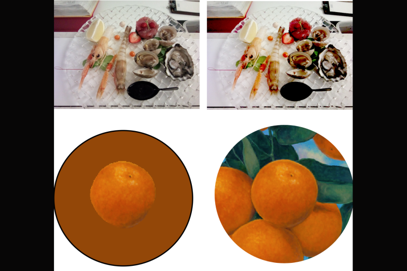
We can observe that in the example above. The colour contrast in the photograph on the top left can be enhanced by a technique called histogram equalisation. This computer vision technique effectively increases colour variability, resulting in higher perceived saturation. Similarly, the colour variability in the surroundings enhances the perceived saturation of the orange (bottom right), which would appear more greyish and less colourful if presented on a uniform background (bottom left).
“It is remarkable how much they knew about use these techniques, which are used to this day in computer graphics,” explained Dr Toscani. “Nowadays the process for enhancing colours is well documented in manuals, explaining how to apply highlights, where to bring out contrast, for example. But it seems the painters knew it all hundreds of years ago,” he concluded.
The researchers hope their findings can lead to further studies exploring different aspects of computer vision and understanding more about historical painting techniques could lead to further improvements in computer graphics software development.